
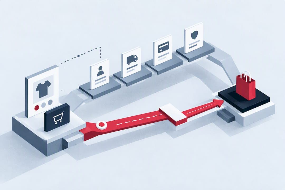
The fastest route to more conversions is fixing checkout and form friction, improving page speed, sharpening landing-page copy and CTAs, matching content to visitor intent, and running disciplined tests rather than guessing. Start today by running a Core Web Vitals check and a checkout completion audit. Resolving checkout usability issues alone can lift conversion rate by up to 35.26% for large e-commerce sites.
TL;DR:
- Fixing checkout usability issues can increase conversion rates by up to 35.26 percent for large e-commerce sites.
- Improving site speed by addressing Core Web Vitals metrics such as LCP and INP directly impacts visitor engagement and trust.
- Tailoring landing pages, headlines, and CTAs to match visitor sources enhances relevance and reduces hesitation.
- Simplifying forms with clear structure, support, and autofill support boosts completion and reduces abandonment at critical points.
- Regular, disciplined testing using analytics, session replays, and A/B experiments ensures fixes align with actual visitor behavior, not guesses.
Table of Contents
- Site speed and Core Web Vitals: the technical foundation of conversions
- Landing page copy, CTAs and layout that convert visitors
- Forms and checkout: where most lost revenue hides
- Contextual relevance: matching pages to how visitors arrived
- Measurement, experimentation and tools that turn guesses into gains
- How WebPro Studio approaches conversion-focused projects
- Personalisation techniques to increase conversions
- User segmentation strategies
- Behavioural targeting and retargeting methods
- Evidence over guesswork
- Ready to put this into practice
- FAQ
- Sources
Site speed and Core Web Vitals: the technical foundation of conversions
Every second a page takes to become usable costs you visitors who never see your offer. Google's Core Web Vitals measure this directly: Largest Contentful Paint (LCP) tracks how fast the main content loads, Interaction to Next Paint (INP) measures responsiveness to clicks and taps, and Cumulative Layout Shift (CLS) catches the visual jumpiness that makes people misclick or abandon. A slow LCP delays the moment a visitor can act, a poor INP makes buttons feel broken, and layout shift undermines trust at the exact moment someone reaches for your CTA.
Start with free, standard tools: run Lighthouse in Chrome DevTools, check real-world data in PageSpeed Insights, and review field data through web.dev's reports. Look for which metric is failing and on which page template, since a slow product page matters more than a slow contact page.
Once you know where the problems sit, work through fixes in order of impact:
- Compress and serve responsive images so large hero banners do not load at desktop resolution on a phone screen.
- Put a content delivery network in front of static assets to cut distance-related latency.
- Set effective browser caching so return visitors do not re-download unchanged files.
- Reduce server response time (TTFB) by addressing hosting or database bottlenecks.
- Inline critical CSS and defer non-critical JavaScript so the visible page renders before background scripts run.
- Lazy-load images and content below the fold so the browser prioritises what the visitor sees first.
A performance-focused case study from Web found that Rakuten improved Core Web Vitals and reported measurable gains in conversion and revenue per visitor, showing that speed work pays back directly rather than just improving a technical score.
After each major change, track LCP and INP in your analytics alongside bounce rate and conversion rate for two to four weeks before drawing conclusions, since traffic mix can skew a shorter window.
Pro Tip: Fix your slowest page template first. A single bloated product or checkout page template often drags down site-wide averages more than any other single issue.
Landing page copy, CTAs and layout that convert visitors
A landing page has one job: get the right person to take one action without making them think too hard. That starts with a benefit-focused headline above the fold paired with a single, unambiguous primary call to action. Secondary links and competing offers dilute attention and reduce completion.
Message match matters as much as the headline itself. When the words on your ad or search result do not appear on the landing page, visitors hesitate, wondering if they clicked the wrong thing. Carry the exact phrase, offer or price across from the source to the page.
For the CTA itself, follow a simple structure:
- Pair an action verb with a tangible benefit, such as "Get a free quote, no obligation" rather than a flat "Submit".
- Make the button visually dominant through colour contrast and whitespace, and avoid a second button competing for the same attention.
- Keep the CTA visible without excessive scrolling on both desktop and mobile layouts.
- Reinforce it with scannable bullet benefits and relevant social proof placed near the decision point, not buried in a footer.
- Strip campaign landing pages of full site navigation so visitors cannot wander off before converting.
Testing ideas worth running include headline variants, CTA text and colour combinations, testimonial placement, and hero image alternatives, each tested one change at a time so you know what moved the number.
Pro Tip: Write your CTA last. Draft the headline and benefit copy first, then write a CTA that directly answers the question that copy raises.
Forms and checkout: where most lost revenue hides
Checkout and form friction is the single biggest lever on this list, because it sits at the exact moment someone has already decided to buy. Baymard Institute's benchmark of 335 sites identifies the top abandonment drivers as unexpected costs, cited by 39% of shoppers, forced account creation at 19%, and an overly complex checkout process at 18%. Showing full costs early, offering guest checkout as the default, and trimming steps address all three directly.

Form design itself follows separate but related principles. Nielsen Norman Group's research on cognitive load recommends four pillars: structure, transparency, clarity and support. In practice that means a single-column layout, progressive disclosure that reveals fields only when relevant, and clear labelling of what is required versus optional. Forms built around these principles can see first-attempt completion rates improve substantially compared with poorly structured equivalents.
A handful of technical details make or break completion:
- Preserve entered data after a validation error instead of clearing the whole form.
- Support browser autofill so returning customers do not retype addresses and card details.
- Use input masks and real-time validation, including card-number checksum validation, to catch mistakes before submission.
- Offer sensible default payment methods alongside recognised third-party wallets.
Track step-by-step completion rate, abandonment by individual step, and form error rate to find the exact point people give up. A worthwhile first test is comparing a prominent guest checkout option against a flow that forces account creation.
Contextual relevance: matching pages to how visitors arrived
A page that ignores where its visitor came from is fighting its own traffic. Someone clicking a paid search ad for a specific offer wants that offer immediately, not a general homepage. Someone arriving from an organic blog post is often earlier in their decision and responds better to education before a pitch. Someone clicking an email reminder already knows the offer and just needs a frictionless path back to it.
Map the shortest realistic path to conversion for each segment:
- Paid search traffic goes straight to a page matching the ad's exact offer and wording.
- Organic traffic gets supporting content that builds a case before asking for the conversion.
- Email traffic skips persuasion entirely and goes to the action itself, with fields pre-filled where possible for returning visitors.
- Campaign landing pages drop the standard site navigation so visitors cannot drift away mid-decision.
Rather than rebuilding every page at once, prioritise your highest-traffic sources paired with your lowest-converting pages. That combination usually hides the largest untapped gain.
Measurement, experimentation and tools that turn guesses into gains
Disciplined testing beats intuition because intuition is frequently wrong about what visitors actually struggle with. The evidence-based cycle, as HubSpot's CRO guidance frames it, runs in a consistent loop:
- Gather quantitative data from analytics and qualitative data from session recordings or user feedback.
- Form a specific, testable hypothesis rather than a vague idea.
- Design a controlled test around one primary metric.
- Run the experiment for long enough to reach a reliable sample.
- Analyse results honestly, including when they contradict the hypothesis.
- Implement what works and feed the finding into the next hypothesis.
Not every idea deserves equal attention. Score each candidate on likely impact, effort to build, and your confidence in the underlying data, and work through the quick, high-impact wins before tackling anything that demands a rebuild.
Your toolset does not need to be elaborate:
- An analytics platform such as GA4 for funnel and traffic-source reporting.
- Session replay and heatmap tools such as Mouseflow to see where real visitors hesitate or click without effect.
- An A/B testing platform to run controlled experiments rather than permanent changes based on a hunch.
Session replay tools frequently surface hidden problems that standard analytics report only as an exit, such as rage clicks on an unlickable element or a form field silently rejecting valid input, and fixing these often delivers a faster win than a copy rewrite. Before launching any test, fix your sample size and primary metric in advance, and check secondary metrics for unintended side effects such as a rise in refunds alongside a rise in conversions.
How WebPro Studio approaches conversion-focused projects
We build and host websites for South African businesses with conversion performance treated as a design requirement, not an afterthought. Our e-commerce builds use WooCommerce with local payment gateways integrated from the start, since a mismatched or unfamiliar payment option at checkout is exactly the kind of friction that costs completed sales.
A typical engagement runs in stages:
- An audit of your current site's speed, checkout flow and landing pages against the priorities covered above.
- A prioritised roadmap ranking fixes by likely impact and effort.
- Short, focused sprints that implement and test one change at a time.
- Ongoing hosting and support through our services so performance gains do not erode as traffic grows.
This structure keeps the work grounded in what your site actually needs rather than a generic checklist applied to every client the same way.
Personalisation techniques to increase conversions
Personalisation works by removing the extra steps a returning or identifiable visitor would otherwise take to reach relevant content. A returning customer shown their past category of interest, a location-aware offer, or a cart reminder pre-filled with the items they left behind all shorten the path to action without adding any persuasion.
Start with the segments you can identify reliably: new versus returning visitors, geographic location, and referral source. Each supports a different, low-risk personalisation:
- Returning visitors see a shortcut back to recently viewed products or an abandoned cart.
- Visitors from a specific region see relevant shipping costs, currency or local payment options up front.
- Visitors arriving from a specific campaign see messaging that echoes the exact offer they clicked.
Avoid over-engineering this. Complex personalisation engines are hard to justify until the basic funnel fixes from earlier sections are already in place, since a personalised message on a slow or confusing page will not outperform a fast, clear one shown to everyone.
User segmentation strategies
Segmentation only earns its place when each group gets a genuinely different path, not just a different label in a report. Useful splits usually fall into a handful of categories: acquisition source, device type, visit stage, and purchase history for returning customers.
Device type deserves particular attention, since mobile and desktop visitors often behave differently enough to need separate layout priorities, even on a responsive site. Visit stage matters too: a first-time visitor needs context and trust signals, while a visitor on their third session is often ready to act and is better served by a direct path to checkout.
Keep segments few and actionable. A dozen overlapping audience definitions rarely produce a dozen meaningfully different experiences, and the maintenance overhead often outweighs the benefit. Pick two or three segments with the clearest behavioural difference and build distinct experiences only for those.
Behavioural targeting and retargeting methods
Retargeting works by reaching people who have already shown intent, which makes it one of the more efficient channels for recovering near-misses rather than attracting entirely cold traffic. A visitor who viewed a product page or started a checkout but left is a warmer prospect than someone who has never visited at all.
Effective behavioural targeting segments these visitors by the action they took rather than treating all site visitors the same: cart abandoned, product-page viewers who did not add to cart, and past purchasers browsing a new category each warrant a different message and, often, a different offer. A cart abandoner usually needs a simple reminder, while a browser who never added anything may need more persuasion before an offer makes sense.
Frequency and timing matter as much as the message itself. Showing the same retargeting ad too often creates fatigue and can damage brand perception, so capping impressions and rotating creative keeps the channel working rather than becoming background noise.
Evidence over guesswork
Most sites do not have a traffic problem. They have a friction problem that disciplined testing finds faster than opinion ever will. A single percentage-point lift sounds modest until it compounds across every visitor for a year. My advice is always the same starting point: pick your highest-value flow, measure it honestly, then fix what the data actually shows.
— Ruvic
Ready to put this into practice
We turn the fixes covered here into working sites rather than leaving them as a checklist for you to implement alone. Our team builds and hosts conversion-focused websites for South African businesses, combining web design and hosting with e-commerce and payment integration in one engagement.

An audit from our team reviews your site's speed, checkout flow, and landing-page structure against the priorities in this article, and returns a prioritised list of fixes rather than a generic report. We typically work in focused sprints so changes ship and get measured rather than sitting in a backlog.
- A technical and UX audit of your current site.
- A prioritised roadmap ranked by likely impact.
- Implementation support through our web design and hosting services.
Get in touch to request an audit and a realistic turnaround estimate for your site.
FAQ
Is 12% conversion rate on a website good?
Whether it counts as good depends heavily on your industry, traffic source mix and what you define as a conversion, so compare against your own historical baseline rather than a single external benchmark.
What do website conversions mean?
A website conversion is any visitor action you define as valuable, such as completing a purchase, submitting a lead form, or signing up for an account. The specific action varies by business model, so an e-commerce store and a lead-generation site will track entirely different conversion events.
How do I get a higher conversion rate?
Focus first on removing friction in checkout and forms, since Baymard's benchmark shows resolving checkout usability issues can lift conversion rate by up to 35.26% for large sites. Pair that with faster page speed, clearer landing-page messaging, and content matched to how visitors arrived, then validate each change with a controlled test.
How do I get more conversions from existing traffic?
Rather than chasing more visitors, improve what happens to the ones you already have by fixing your slowest-loading pages and your highest-abandonment checkout steps first. Session replay and heatmap tools often reveal hidden usability bugs that analytics alone report only as an unexplained exit, and fixing these frequently produces a faster lift than adding new traffic sources.
What tools help diagnose conversion problems?
Start with Lighthouse or PageSpeed Insights for performance issues, an analytics platform such as GA4 for funnel drop-off, and session replay or heatmap software to see where real visitors hesitate. Together these cover the technical, quantitative and behavioural angles needed to form a reliable hypothesis before testing a fix.
Sources
- How to Reduce Cart Abandonment (Data-Backed UX Strategies) – Baymard
- Web form design — Nielsen Norman Group
- Conversion rate optimization (CRO) strategy for 2026 — HubSpot
- Web
- Conversion Rate Optimization: Complete Guide | Mouseflow